Wednesday, 24 April 2013

First Magazine Draft


This was the idea I had in mind for my magazine cover initially, which I later changed my mind and instead went with the Radio Times layout. The layout I used in my first draft is your typical soap magazine cover, with the tacky background and loud colours. Here are existing magazine covers which follow this layout.


Poster editing


This is a screenshot of the editing process of the design of my poster, where I used Adobe Photoshop. I edited the picture of the 3 main characters to a cold effect, which is also similar to a number of skins posters (see below). I used the background of a graffiti'd wall to show that the characters are involved in gangs, drugs and violence.


Editing

Beca and I are currently editing our trailer and we have taken some screenshots to show the process.


Friday, 22 February 2013

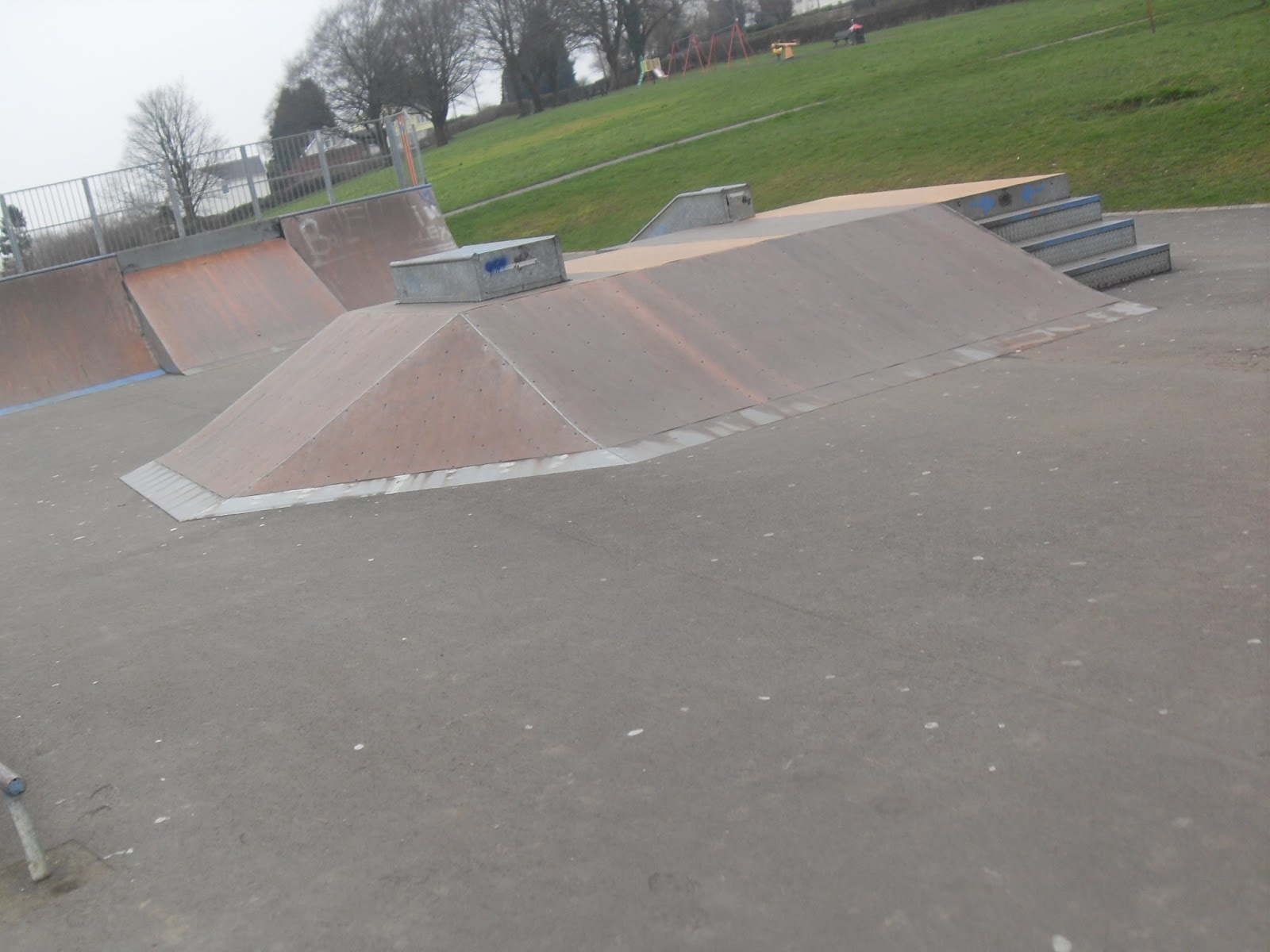
More Location Shots

Here is a small selection of our Photoshoot up Llanharan skate park.


BBC3

Originally, we planned on broadcasting our soap opera on the channel E4, but after researching and filming, we have decided that 'The Vale' bests suits BBC3, rather than E4. E4 shows programmes like Skins and Misfits, whereas the BBC shows more milder soap operas, such as Eastenders and Waterloo Road.


This is the logo we have chosen to feature in our soap opera trailer.

Magazine ideas

As the editing is completed, I am now focusing on the design of my TV magazine. I am debating over which route to go down, the traditional soap magazine or Radio Times layout. I think the traditional soap magazine would suit our programme 'The Vale' more, however it is difficult not to make the magazine look tacky. Radio Times would be easier to accomplish, but less suitable for 'The Vale'.

Radio Times

Traditional soap magazine

Editing screenshots

After the large quantity of snow and rain, our filming was completed and now the majority of our editing is done, we are now designing our magazine front page and looking for new ideas. Here are a few screenshots from the editing process;

 Here is how we changed all over clips/scenes into an effect which blurs the corners of the screen. I think it makes the clips look more professional and it adds a dark, eery effect.

Here is how we stabilised the 360o shot. As the filming was done by hand, it made the camera more shakey so by stabilising it, it made the viewer less dizzy and look more professional.

Here is where we were adding transitions in between shots, to clarify between each scene. We later decided to erase most of these, leaving only 4.